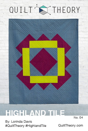
I’m so excited to share with you today some more details about Highland Tile, my debut quilt pattern for a new pattern company called Quilt Theory. In celebration, I have a giveaway for you as well!
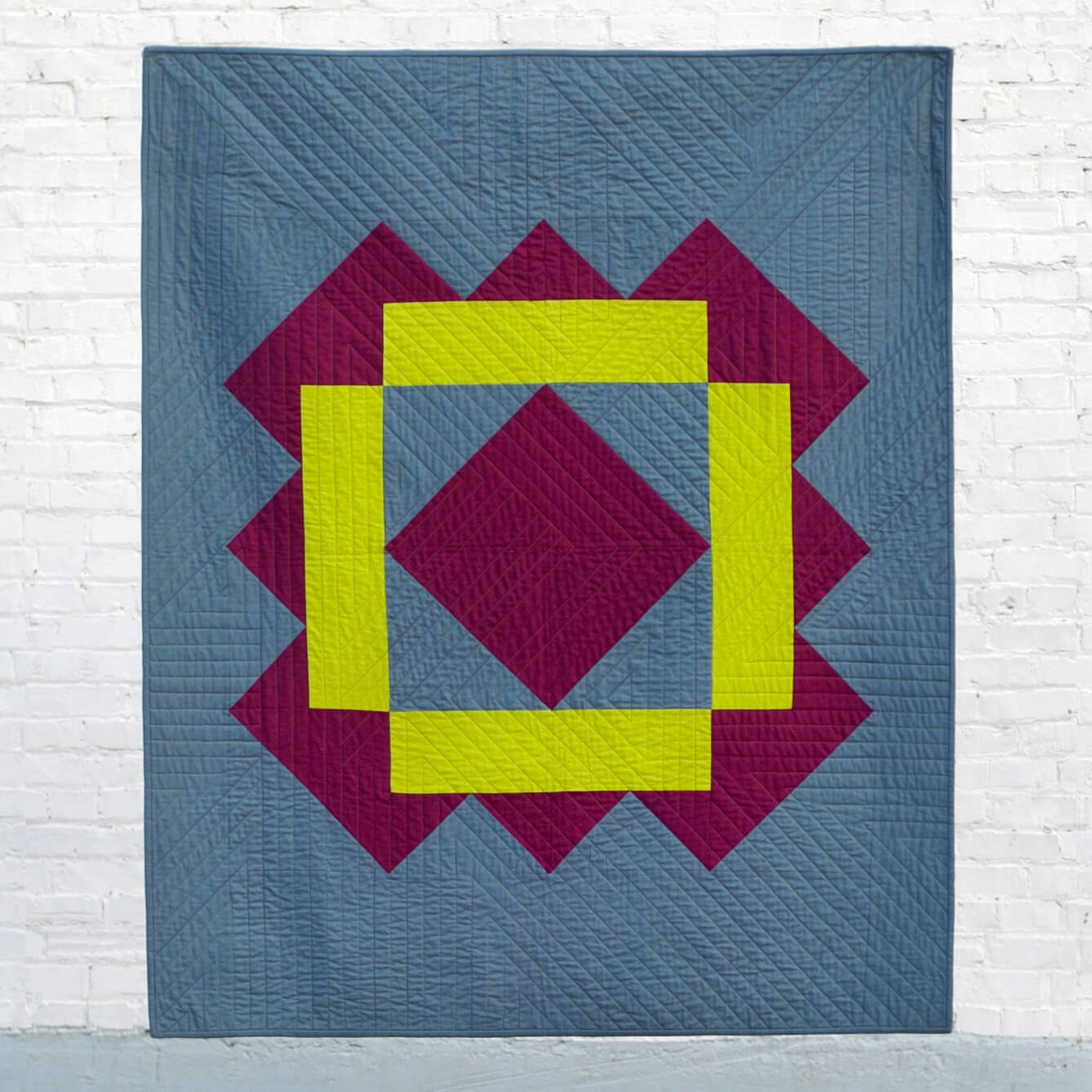
Photo by Michelle Bartholomew
First, a little about Quilt Theory:
In February 2016, a group of quilters connected to cultivate relationships with others running businesses in the quilting industry. A tight-knit group was quickly woven together as we shared successes, answered questions, and supported one another. What started as a way to collect real-time insight and expertise quickly evolved into an opportunity to collaborate.
Our goal at Quilt Theory is to create simple and modern quilt patterns, and we challenged ourselves to design a line of patterns printed on small cards. As a group, we have become a strong team as we worked through pattern writing, testing, editing, and quilting.
Quilt Theory designers have been featured in 20+ major quilting publications and international quilt exhibits. Combined, we have 47 years of quilting experience, and we are excited to share our debut collection for Fall 2016.
PDF patterns are available now through our website QuiltTheory.com. Pattern cards are coming soon to a local quilt shop near you! Let your local quilt shop know you want them to carry Quilt Theory patterns.
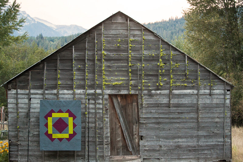
Photo by Michelle Bartholomew
When I first started thinking about my Quilt Theory design, I wanted to create something that would make even a beginning quilter feel like they could pull it off well. I liked the idea of an over-sized block made into a whole quilt because it gives a lot of visual impact but doesn’t take a ton of time. I also thought that more experienced quilters would appreciate that this is a quick-finish quilt!
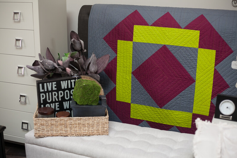
Photo by Michelle Bartholomew
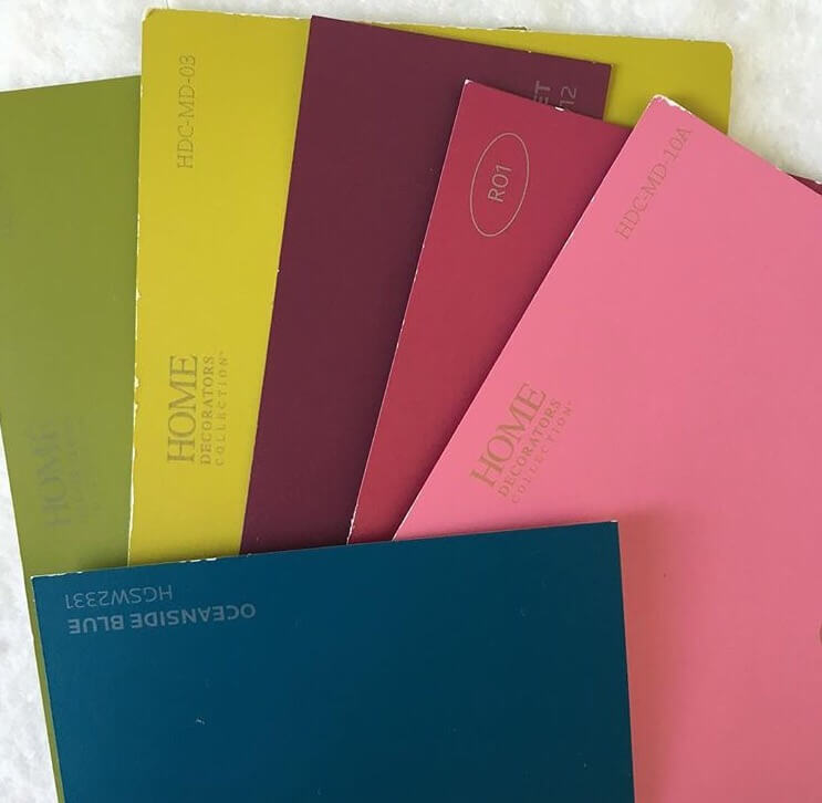
As I was designing, I was reminded of the medallions and bold colors you see in Mexican tiles. So of course, I had to choose a bold color scheme. And this one was certainly out of my normal comfort zone!
While looking through the pictures on my @dailycolorpalette Instagram account, I saw this palette and decided to use the burgundy and chartreuse.
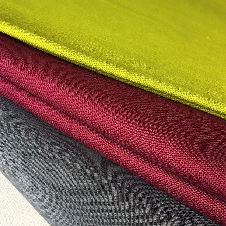
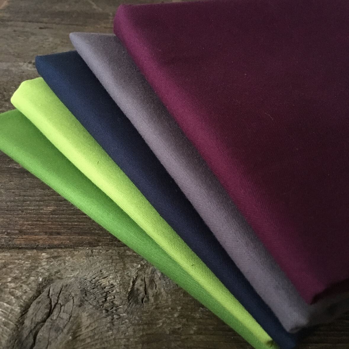
Robert Kaufman was kind enough to send me some Kona cotton solids to make this quilt. I selected Bordeaux, Peapod, and Graphite.
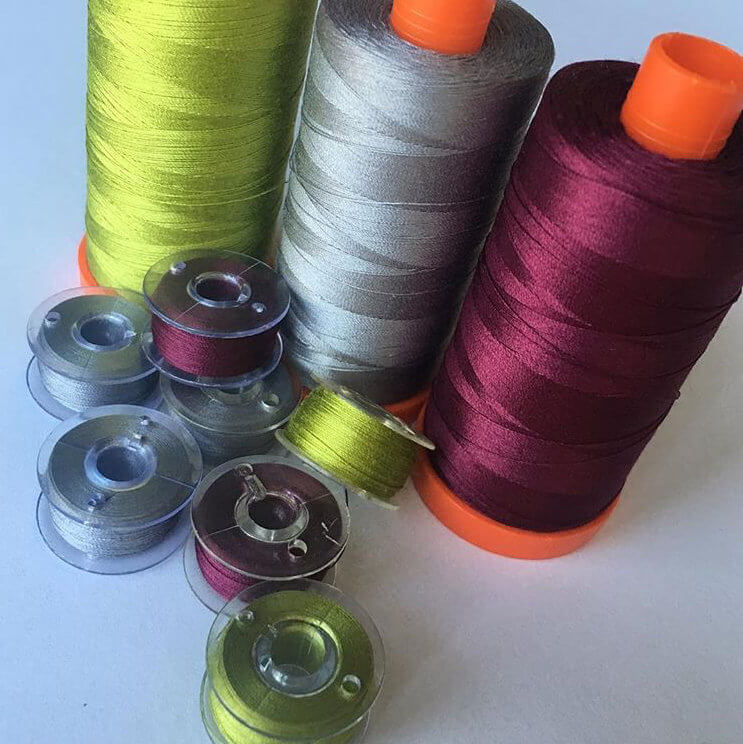
When it came time to choose thread, there was no question- Aurifil is the absolute best in my opinion! I was so thankful to them for sending me these gorgeous colors for my quilt. They are 1147, 2605, and 4030.
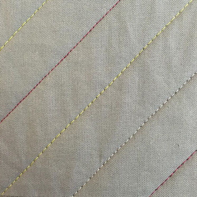
I had a lot of fun quilting this one!
Handing this baby off to our fearless leader Michelle was tough, but I knew it was in good and capable hands, and I am so thrilled with the beautiful images she took!
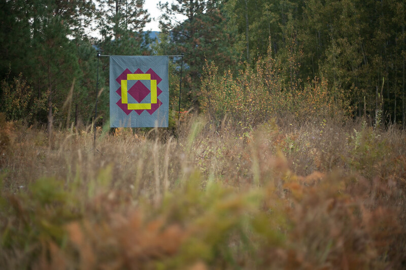
Photo by Michelle Bartholomew
I especially love the photos that Michelle took at Urban in Cashmere. I will definitely be stopping in there for a little shopping on my next trip across the mountains!
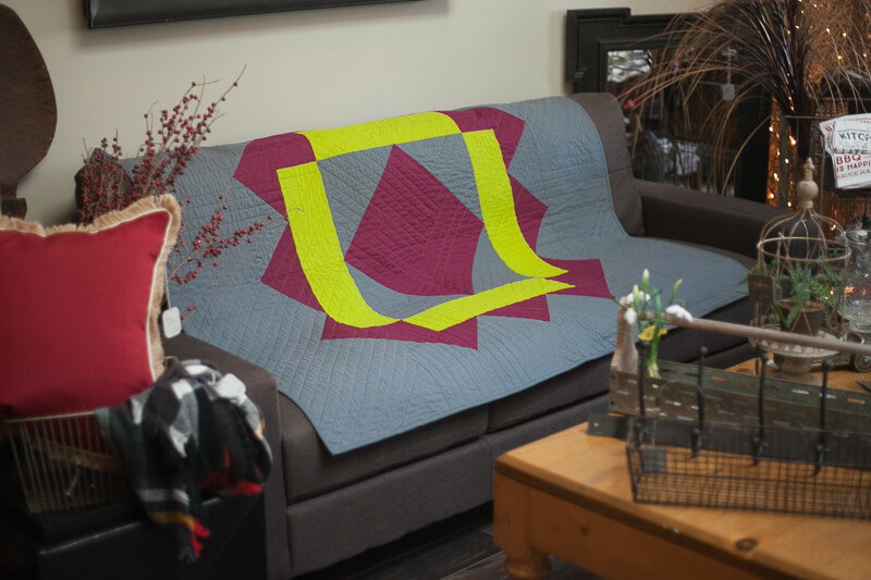
Photo by Michelle Bartholomew
Now on to the giveaway!!
To celebrate the launch of Quilt Theory, I am giving away a copy of my pattern, Highland Tile (printed or PDF, your choice!), a PDF of all of the Quilt Theory Coloring Pages, and a half yard bundle of delicious Robert Kaufman Kona solids. If you’ve been following me long, you know how much I love working with Kona solids, so I wanted to share some with one of you! These are Grass Green, Chartreuse, Navy, Coal, and Eggplant.
_____________________
The giveaway ends Wednesday, October 19th, at midnight Eastern time and a random number generator will select the winner. Giveaway open to participants 18 years or older and international participants are welcome. (I can only ship the fabric within the U.S., but international entrants can still win the pattern and Coloring Page PDFs. If an international entrant is selected, I will randomly select a second winner for the fabric bundle.)
*If you buy my pattern and then you win it, I’ll refund you or let you pick out another free Quilt Theory pattern
To Enter:
Simply leave me a comment letting me know what colors you would use to make your own Highland Tile quilt.
For a bonus entry, let me know how you follow me!
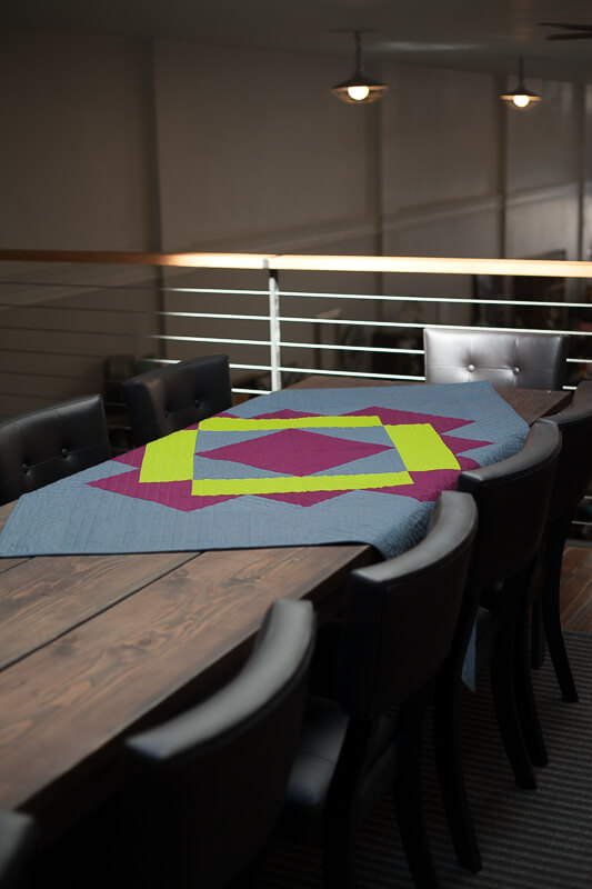
Photo by Michelle Bartholomew
I’m at the tail end of this blog hop, but be sure to visit any of the designers that you may have missed this week! And don’t forget that Quilt Theory will be posting again on Monday…. you wont want to miss it!
Quilt Theory Release Blog Hop Schedule
Friday 10/7 – Quilt Theory
Saturday 10/8 – Yvonne @Quilting Jetgirl
Monday 10/10 – Daisy @Ants to Sugar
Tuesday 10/11 – Cheryl @Meadow Mist Designs
Wednesday 10/12- Kitty @Night Quilter
Thursday 10/13 – Michelle @Michelle Bartholomew
Friday 10/14 – Stephanie @Late Night Quilter
Saturday 10/15 – Lorinda @Laurel Poppy and Pine
Monday 10/17 – Quilt Theory
Please let me know if you have any questions about Highland Tile, and Happy Sewing! ~L
I love the simplicity of this quilt. It would be easy to make yet is very pleasing to the eye. I’m thinking shades of blue with a touch of yellow to zing it up. Thank you for the opportunity to win.
LikeLike
I really like your quilt! I would definitely use the gray chartreuse and a Aqua color.
Thanks
LikeLike
I am loving all of these Quilt Theory patterns! Beautiful. I adore your color choices. Very bold and striking. I can see this quilt in so many different color ways. Like seafoam greens or black , white, and red. How fun!
LikeLiked by 1 person
I can see this in Robert Kauffman Prisma Dyes, in Moss, Denim and Burgundy. This has been a fantastic journey, and to think you are the end is quite sad. Super patterns, beautiful photo shoot settings, and the background on each quilt is a huge bonus.
LikeLiked by 1 person
Thank you so much, Jean! I’m glad you liked the patterns. You can certainly look forward to more from us! Michelle did such a great job photographing the quilts, didn’t she?
LikeLike
I follow you on Blogger with my blog list of friends.
LikeLiked by 1 person
Such a nice design Lorinda! The colors are stricking too. I would make it in purple and grey like you but switch out the lime for a bright orange! I love orange. Congratulations this new pattern company is great and exciting.
LikeLiked by 1 person
Also I follow everywhere I know to, Instagram, Twitter, Facebook, blog, Periscope
LikeLiked by 1 person
What a wonderful quilt-and as a beginner quilter, I can really do this! I love your colors-you certainly pulled off the bold color scheme. I would choose for myself a turquoise background with brown and bright green!
LikeLiked by 1 person
Susan, you totally can do this!! I hope you make it, and be sure to send me pictures because your version sounds fabulous!
LikeLike
Just found you by following MeadowMistDesigns. Love your simple big block. Would likely go for the navy background with a soft white and light blue!! Will continue to follow all of you new designers!!
Carol
LikeLiked by 1 person
So pretty, Lorinda. 🙂 I’m really loving navy lately, so I think I would go with navy, mustard, and one other color, maybe white or mint?
LikeLiked by 1 person
Lime green, turquoise and navy are my first picks. Love these new Quilt theory patterns.
LikeLiked by 1 person
I am a new follower by email. Looking forward to your posts.
LikeLiked by 1 person
For some reason, a navy and teal color scheme on a lighter gray background is popping into my head when I see this quilt. I think that’s what I’d have to try! I love your choices as well though!
LikeLiked by 1 person
Thanks, Kim! Maybe the Quilt Theory logo is subconsciously inspiring your color choices! 😀
LikeLike
I am really enjoying hearing about designing the Quilt Theory quilt patterns. I would make this quilt in Chartruse, Navy or Cobolt, and dove gray.
LikeLiked by 1 person
I follow your blog by email and Your posts on IG. Love them both.
LikeLiked by 1 person
I think I would use purple and turquoise and navy in some form.
LikeLiked by 1 person
I think I like Quilt Theory!!Thanks for sharing and the giveaway! I would make this quilt in blue, green, purple-my favorite colors!
LikeLiked by 1 person
I follow your Blog.
LikeLiked by 1 person
I follow you in IG
LikeLiked by 1 person
I would. Chose pink purple & black
LikeLiked by 1 person
I would do a gray and navy combo to go with my living room. Loving all the Quilt Theory team–these patterns are just my style
LikeLiked by 1 person
Beautiful quilt! I think I’d make it in blue and yellow and maybe a grey background!
LikeLiked by 1 person
I’m following you on instagram and by email.
LikeLiked by 1 person
I love the sing oversized block! I’m thinking I would make the background dark, like maybe eggplant or midnight, and then use 2 lighter colors in the block–maybe a blue and a paler purple? I’d have to get out my Kona color card and play!
LikeLiked by 1 person
Your quilt is striking! Those photos are equally awesome. And from experience a quilt I’ve seen in a photo that grabs me, like this, is unimaginably MORE stunning in person! My quilt will be gray/dk. Turquoise and Lime!
LikeLiked by 1 person
Thank you for your sweet words, Melody! And your color choices sound gorgeous- can’t wait to see it!
LikeLike
I love the chartreuse in your Hoghland Tile quilt! I’d make it with a similar green, / bright purple and charcoal background. I’m a fan of peppered cottons so I’d probably use them!
I follow you on Instagram. 😊
LikeLiked by 1 person
I really like your color choices. I would probably do a reds and white or blues and grey.
LikeLiked by 1 person
I follow on BL.
LikeLiked by 1 person
This is a great pattern! I’d use midnight blue, raspberry, and a pale pink or pale periwinkle. Thanks!
LikeLiked by 1 person
Jenni, I love that idea!
LikeLike
I am following you on Instagram now!
LikeLiked by 1 person
Hi Lorinda! I would use the same colors that you did for this quilt. Your quilt is absolutely gorgeous! Thanks for sharing it!
LikeLiked by 1 person
I’m now following you on Instagram. Thanks again!
LikeLiked by 1 person
I think your color choices are perfect, I would use the same!
LikeLiked by 1 person
I follow your blog.
LikeLiked by 1 person
I’m wondering if I could pull off a “red as a neutral” background with deep navy for the base color and then a bright gold for the accents. What do you think?
LikeLiked by 1 person
I think that would be an amazing version of this quilt!!
LikeLike
Beautiful quilt! There’s almost an Amish quality in the simplicity of the design! Very elegant! I would probably run with some Amish style colors…black,burgundy and grey! Good luck with your endeavor!
LikeLiked by 1 person
I think this would look great in primary colours. Red Blue Yellow
LikeLiked by 1 person
Cool!
LikeLike
I follow you on blog lovin
LikeLiked by 1 person
Dark blue background, darkish red then grey for the square in the center. I live in football country and an Alabama friend of mine would just love this quilt.
Following on facebook.
LikeLiked by 1 person
Love the quilt! I would enjoy it in gray, lime and navy!
LikeLiked by 1 person
I would love to see that!!
LikeLike
I’m loving mustard and eggplant right now. I’d have to think on the background color.
LikeLiked by 1 person
Kona Silver might be a nice backdrop for those rich colors!
LikeLike
I follow you on IG.
LikeLiked by 1 person
I follow you on Facebook and I would choose sky blue, yellow, and gray.
LikeLiked by 1 person
I just found your blog as I’m looking at the Quilt Theory blog hop. Love your color choice, very striking.
LikeLiked by 1 person
Thanks, Margo! Glad you found me!
LikeLike
I have some lovely blues & purples that I can see using for this quilt!
LikeLiked by 1 person
I follow you in Instagram.
LikeLiked by 1 person
I do like the colors you chose. I might use blues and greens or possibly brights with a black background.
LikeLiked by 1 person
I follow you on Bloglovin
LikeLiked by 1 person
I would probably use purples and yellow greens with a pop of gold or orange
LikeLiked by 1 person
I would probably use purples and yellow greens with a pop of gold or orange. So many beautiful quilt designs in the collection
LikeLiked by 1 person